

Pinpointing a shade of red for an interior can be quite tricky, but if you land on the right one, it can inject energy and style into your space. To help with your search for the perfect red paint color, we checked in with a selection of go-to designers to find out their favorites. Scroll down for a look at the tasteful red paint colors that are worth considering for your own abode.
HERITAGE RED, BENJAMIN MOORE
"We love experimenting with unique shades of a wide range of paint colors, but when it comes to red, classic is always our go-to. There is nothing more rich, warm, and vibrant than high gloss Heritage Red HC-181 from Benjamin Moore's Historical Color deck. It's the perfect front door, wood framed chair, or vintage credenza gloss." — Emilie Munroe
INCARNADINE, FARROW & BALL
"This classic shade of crimson reminds me of the glamorous 1970s and feels inspired by mid-20th century artists like Rothko and Mother well. I’ve recently used it in the interior of a credenza for a surprising contrast to an otherwise conventional piece." — Patrick Ediger
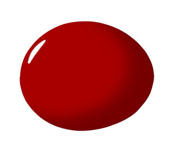
CALIENTE, BENJAMIN MOORE
"I love to use this red in small powder baths or larger spaces such as a dining room or lounge. It works perfectly in rooms with dark jewel tones or rooms with crisp white or bright colors." — Darla Bankston May
SHOWSTOPPER, SHERWIN-WILLIAMS
"The name says it all—it's a showstopper! This red is great, as it's not orangey, not too bright, and not too burgundy. It's the perfect pop to stop people in their tracks and take notice. It's fun, playful, and powerful at the same time. This red is perfect for making a statement in a dining room, but it's also fun for a front door, or can be a playful color when refinishing a furniture piece." — Linda Hayslett
BLAZER, FARROW & BALL
"My favorite red paint right now is the very regal and charming Blazer Red from Farrow & Ball (no.212). It is close to an orange red. The terra-cotta hues soften its perception, making it comforting rather than aggressive. It's a perfect option for those seeking a rich color, but scared of a classic red's loudness." — Yuna Megre
BIG APPLE, CLARE PAINT
"One of my favorite red paint colors is from our Clare palette. I’m obsessed with Big Apple. It’s a deep, rich red that’s bold and delicious and is named in honor of New York City, Clare HQ's hometown and the greatest city in the world." — Nicole Gibbons
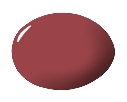
SUNDRIED TOMATO, BENJAMIN MOORE
"This deep rusty red is sultry and beautiful. As someone who rarely uses color in interior spaces, this is one of those colors that I can pair back with grey, beige, concrete and rich woods that add depth and saturation without being too stately." — Becky Shea
ALIZARIN, BENJAMIN MOORE CENTURY
“It’s my favorite red because it evokes the deep, dark red of a raspberry. One with hints of purple, green and blue. As in a raspberry that’s found in nature.” – Alex Papachristidis
RECTORY RED, FARROW & BALL
"My favorite red paint is Rectory Red by Farrow & Ball. It is sophisticated and looks divine lacquered a la Mrs. Astor's library by Albert Hadley!" — CeCe Barfield Thompson


Your Message